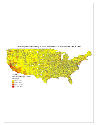
The “Asian Population Density in the Continental U.S. Based on Census 2000” map shows the ratio of Asian people to the total number of people in their respective county of residence. Data that was used to base the percentage off of were the total number of Asian people in each county divided by the total population of that particular county. The map shows a significant, dense shading of colors on the western part of the United States, specifically in the Pacific states of Washington, Oregon, and California. A considerable amount of dense shading can also be seen on the northern part of the Atlantic seaboard. The darker colors symbolize a higher percentage of the region’s population as claiming to be Asian, with 46.04% being the maximum ratio of Asian Americans in a certain county. Notable counties with high percentage of Asian Americans can be found in Seattle and San Francisco. One explanation for this could be the fact that during World War II, the U.S. government set up camps along the western coast of the United States (mainly in northern California) to keep people of Japanese descent confined due to the war against Japan. Many may have remained in those camps and settled their families around the same cities. The map also shows white spots in which population totals were null.
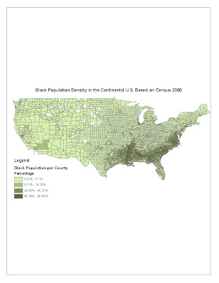
The “Black Population Density in the Continental U.S. Based on Census 2000” map shows the ratio of African-American people to the total number of people in their respective county of residence. Data that was used to base the percentage off of were the total number of African-American people in each county divided by the total population of that particular county. The map shows a significant, dense shading of colors in the Southern Belt of the United States, which includes the states of Mississippi, Alabama, Georgia, Louisiana, North and South Carolina, and up to Virginia. The darkest regions, symbolizing a high percentage of African-Americans within the county population (with a maximum percentage of 86.49% of the population), can be generally found in the central parts of the Southern Belt states. One reason for this could be explained by the Civil War during the mid-1800s. Slaves were a big part of U.S. history, and most of these slaves were of African descent. Slavery was not abolished until the late 1800s. Numerous slaves were used to tend to the cotton fields that spanned the majority of the land in the Southern Belt. After the abolishment of slavery, many families remained and raised their families around the same regions as the cotton fields they toiled at. Slavery also became a “cultural” lifestyle for many families in the 1800. The blues, “soul food”, and “southern hospitality” originated from this cultural lifestyle, many of whom have remained in the region because of this. The map also reveals some white sports in which population totals were null.
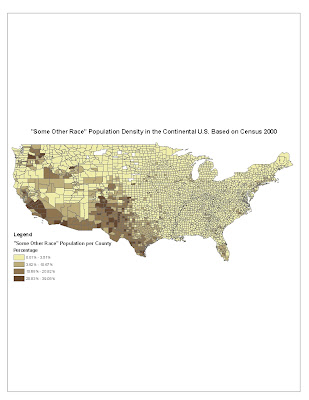
The “’Some Other Race’ Population Density in the Continental U.S. Based on Census 2000” map shows the ratio of people whose race is not Asian nor Black to the total number of people in their respective county of residence. Data that was used to base the percentage off of were the total number of people who claimed ‘Some Other Race’ in each county divided by the total population of that particular county. The map shows a significant, dense shading of colors in the western part of the U.S., particularly in California, Arizona, New Mexico, Texas, Colorado, and Washington. The darkest regions, symbolizing a high percentage of people claiming to be “Some Other Race,” can be found in the southern region of the Rockies, near the Mexican border in Arizona and California, and in the eastern part of the state of Washington. The people who claimed to be “Some Other Race” could possibly be one of the following: Native Americans, Hispanic descent, or Mixed-race. The reason for this could be that these dark regions correlate to the locations of Indian reservations and to the proximity to the Mexican border. There are numerous Indian reservations in the southern Rockies region and the eastern part of Washington. Additionally, there are a considerable amount of migrant workers from Mexico who work in the central part of California harvesting the fields- many of whom have decided to settle with their families in that region. The white spots on the map symbolize null totals for population.
Conclusion
The series of population density maps shown here reveals ways that GIS data can be manipulated. One can take data from another source, fix it so that it is compatible with each other, and construct a map with a purpose. By isolating data of certain races, and then relating it to data of counties in the U.S., one can create a map showing population density. Making such maps is beneficial in many ways. One can use these maps with the combination of other maps, to analyze cultural patterns, take note on race and its economic effects, compare education successes between different races and population densities, etc. One pitfall to these types of maps is accuracy. Not ever person in the U.S. fills out and turns in a census survey. Some people do not know what race to claim for themselves, while others wrongfully check a different box. Additionally, the data is very time-sensitive. People who decide to move out of the city days after filling out the census survey makes the data a little bit more inaccurate. There is also a constant cycle of the births and deaths. One should only comprehend the map based on the actual data that was used at the time of the map creation.


No comments:
Post a Comment