UCLA
Monday, July 26, 2010
Sunday, July 25, 2010
Introduction to ArcMAP
This poster on the proposed airport expansion was made possible by the use of ArcGIS. Lab 2 enabled me to utilize ArcGIS and use its features to create such maps. I was able to explore data from various types of files, such as geodatabases, shapefiles, and layers. I learned the basic tools that help construct a map to one’s purpose- i.e. zooming in and out, changing views, manipulating symbols and colors, adding titles and legends, etc. My first experience with ArcGIS went even deeper with the manipulation of the date, such as changing the units of measurement for display, selecting which data to display, adding and joining multiple data frames, creating a graph, etc. I was also able to sample how ArcCatalog functioned by analyzing the metadata and files the geodatabase carried.
The tutorial walked me through some basic steps on how to construct a map that has a purpose, enabling me to make it as easy as possible for an audience to view my maps. Doing steps such as adding titles or legends, or changing the color scheme on a map might make it that much easier for one to understand the map. Re-drawing a map to show only certain features serves to be useful for one to convey a message, and for one to comprehend this message. The user can also gather different data and join them together to make a new and different layer on a map. Furthermore, this layer could be isolated to prove a point, or just to point out some features that are harder to see on a different map. The control that ArcGIS gives the user is tremendous, and it serves as a benefit for both the user and the audience.
The potentials of GIS are numerous. To have such control over the construction of a map becomes very useful for professionals and students alike. For an example, professionals like scientists who are doing research over a mountain side that has potential for mudslides must map out that type of vegetation this area consists of, soil type, etc. With the use of GIS, professionals like these scientists are able to do some research out on the field, and incorporate it into ArcGIS and manipulate the data. They can assign different colors for each different types of vegetation in the area, and similarly with the soil type. They can also incorporate data from another source such as rainfall totals and magnitudes of mudslides for given periods of time. The technology for dealing with GIS has open many opportunities for creation of maps. These maps have only gotten better with details and purpose. GIS software have been used for a wide array of purposes- geographical mapping of locations, environmental studies for surviving ecosystems, population densities, marketing, criminology, climate change, and more. In the case of the scientists using GIS software to map out a mountain side and analyze its mudslide risks is an example of how GIS can help society. With this knowledge, they will be able to construct plans of evacuation, or even better, predict the actual events of mudslides and warn the adjacent neighborhoods of the looming danger.
The use of GIS does come with some pitfalls. Accuracy is a big question when it comes to technology and GIS. The source of the data and how it is utilized or encoded with GIS software is crucial. Research out on the field to gather data plays an important role in the accuracy of the data used in GIS software. One may get information from the field by walking through the region and recording data. Another way of retrieving data could be from satellite images. The fact that there are more than one way to retrieve data changes the accuracy of the resulting maps. Scaling is important as well when incorporating real world data. Most information are able to be mapped, but sometimes the conversion of data into layers on the software may leave out some crucial information (i.e. boundary lines of vegetation). The improvement of GIS technology and electronic data-collecting will ultimately improve the accuracy of maps being made.
Thursday, July 22, 2010
Spatial Analysis
99 counties
2. Which county in Georgia contains the largest number of people, as of the year 2001?
Fulton County (832,094 people)
3. How many cities, with populations greater than 15,000, are located within the State of Washington?
39 cities
4. How many miles long are all of the interstates that are crossed by the outline of Los Angeles County?
3,851.13751 miles
5. Simplify the UrbanBoundaries feature class so that only the urban areas of Los Angeles County are visible (Hint: you will use one of the overlay functions: clip, intersect, or union). Include a screenshot of this new layer in your blog. How many acres of urban area lie within Los Angeles County?
1,367,446.796875 acres of urban area
6. How many zip codes have their centroid in Los Angeles County?
522 zip codes
7. Create a layer displaying the provinces of Canada using the data provided to you in the Canada dataset. Save this new layer under the Canada dataset using the name Provinces. Include a screenshot of this new layer in your blog.
8. Which Native American Indian Reservations lie within 75 miles of the City of Thurso in Quebec, Canada?
Doncaster Indian Reservation 17
Kitigan Zibi Indian Reservation
Kahnawake Indian Reservation 14
Kanesatake Indian Reservation 16
Akwasasne Indian Reservation 15
Tuesday, July 20, 2010
LAB 4: U.S. Census 2000
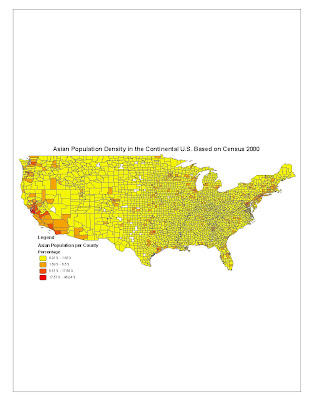
The “Asian Population Density in the Continental U.S. Based on Census 2000” map shows the ratio of Asian people to the total number of people in their respective county of residence. Data that was used to base the percentage off of were the total number of Asian people in each county divided by the total population of that particular county. The map shows a significant, dense shading of colors on the western part of the
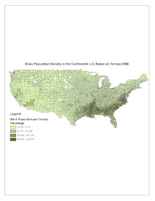
The “Black Population Density in the Continental U.S. Based on Census 2000” map shows the ratio of African-American people to the total number of people in their respective county of residence. Data that was used to base the percentage off of were the total number of African-American people in each county divided by the total population of that particular county. The map shows a significant, dense shading of colors in the Southern Belt of the
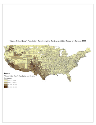
The “’Some Other Race’ Population Density in the Continental U.S. Based on Census 2000” map shows the ratio of people whose race is not Asian nor Black to the total number of people in their respective county of residence. Data that was used to base the percentage off of were the total number of people who claimed ‘Some Other Race’ in each county divided by the total population of that particular county. The map shows a significant, dense shading of colors in the western part of the
Conclusion
The series of population density maps shown here reveals ways that GIS data can be manipulated. One can take data from another source, fix it so that it is compatible with each other, and construct a map with a purpose. By isolating data of certain races, and then relating it to data of counties in the
Google Maps and Neogeography
View My Outdoor Activities in a larger map
Neogeography is a user-generated type of mapping. It is user-eccentric, meaning the creators of these maps could add their own contents and have their own theme. The purpose of these maps is so that one can find things easier, as opposed to sifting through unrelated data on the map. Store Locators are examples of neogeography.
The potentials for neogeography are great. Since the user is able to control the type of contents that will be shown on the map, one could expect a neogeographic map to contain detailed information on certain locations. There is a limitation to this in that it does not show ALL the locations. It may be detailed, but it will only show information that the creator of the map has or is in favor of. For an example, if one where to search for a map of local hamburger joints, a neogeographic map would show locations of hamburger joints that are nearby. However, the creator of this map most likely only included the hamburger joints that he/she has been to before, or is a favorite, thus the map might not show all the nearby joints.
Another great potential is the detailed information that can come with the locations. For store locators, it will list not only the addresses of the stores, but perhaps also where to find parking, or hours of operations. For hamburger joints, it could come with the address and some reviews about that joint. For camp sites, it may show the price of renting and if there is access to a bathroom. A limitation to these detailed locations is that it may not show all the information that is being searched for. Users might want to know more than just reviews of the hamburger joints, such as the prices and how the atmosphere is. Users may want to know if the drive up to certain camp sites are easier than others. There are just some information that is hard to convey in maps.
In conclusion, neogeography is a useful field in that it provides detailed information for users who are searching for specific things. It is also a way to share memories and events with friends, or personalizing regions around you. This could be beneficial to users if they're purposes where to re-live moments, or to understand your stories. Or, it could be beneficial if one were just simply searching for a good place to eat. There are, however, some information that is hard to convey through these maps.
Wednesday, June 23, 2010
Beverly Hills Topographical Map
Beverly Hills quadrangle
2. What are the names of the adjacent quadrangles?
Canoga Park, Van Nuys, Burbank, Topanga, Hollywood, Inglewood, Venice
3. When was the quadrangle first created?
2009
4. What datum was used to create your map?
USGS North American Datum of 1983
5. What is the scale of the map?
1:24,000 inches
6. At the above scale, answer the following:
a) 5 centimeters on the map is equivalent to how many meters on the ground?
1,200 m
b) 5 inches on the map is equivalent to how many miles on the ground?
1.89 miles
c) one mile on the ground is equivalent to how many inches on the map?
2.64 in.
d) three kilometers on the ground is equivalent to how many centimeters on the map?
12.5 cm
7. What is the contour interval on your map?
20 feet
8. What are the approximate geographic coordinates in both degrees/minutes/seconds and decimal degrees of:
a) the Public Affairs Building?
(34°04'15", 118°27'15"), (34.317°, 118.70°)
b) the tip of Santa Monica pier?
(34°0.5'30", 118°30'), (34.51°, 118.50°)
c) the Upper Franklin Canyon Reservoir?
(34°07'45", 118°24'30"), (34.87°, 118.90°)
9. What is the approximate elevation in both feet and meters of:
a) Greystone Mansion (in Greystone Park)?
528 ft./158.5 m
b) Woodlawn Cemetery?
140 ft./42.7 m
c) Crestwood Hills Park?
700 ft./213.4 m
10. What is the UTM zone of the map?
Zone 11
11. What are the UTM coordinates for the lower left corner of your map?
(34°00', 118°30')
12. How many square meters are contained within each cell (square) of the UTM gridlines?
1000 sq. m.
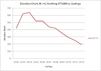
13. Obtain elevation measurements, from west to east along the UTM northing 3771000, where the eastings of the UTM grid intersect the northing. Create an elevation profile using these measurements in Excel (hint: create a line chart). Figure out how to label the elevation values to the two measurements on campus. Insert your elevation profile as a graphic in your blog.
14. What is the magnetic declination of the map?
-13.2° (13.2 W)
15. In which direction does water flow in the intermittent stream between the 405 freeway and Stone Canyon Reservoir?
Northerly direction (flowing to the north)
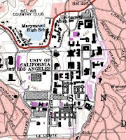
16. Crop out (i.e., cut and paste) UCLA from the map and include it as a graphic on your blog.